Refreshing the Rainbow (February 13th) …
February 13 – Refreshing the Rainbow: Find a color without a name (there are quite a few of them) or a color that has a name that could well use replacing. Create a fresh name for your hue and go through the day looking for that color while informing others of its name (e.g. I helped re-name Crayola’s “macaroni & cheese” as “muntella” and have been telling people, especially children, about it ever since). If feasible, find a ribbon or article of clothing and wear your color today. Bonus Activity: Find the color you dislike the most and rename it as well, giving it a name that reflects something fun or beautiful. If feasible, find either a ribbon or an article of clothing (or anything) that exhibits this color and wear it for a day as well.
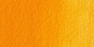
I have been fascinated by colors ever since I was a little child – the probable result of growing up in a room where all the furniture had been painted chartreuse (yellow-green) by my mother. Oddly enough, “chartreuse” was the first color I ever knew by name. Along with “indigo-purple” (a color for which I still have yet to find an appropriately Wonder-full name), my third favorite hue was yellow-orange – a hue labeled by the folks at Crayola as “macaroni & cheese”.
Despite my deep-seated love of this particular noodle-dish (it is still one of the few things that I can cook very well), I found that particular name almost offensive. How could such a warm and vibrant color be shackled with such a title?
This was the color of fluid tempo,
the steady growth of our constant rebirth,
and the glow of every perfect sunrise.
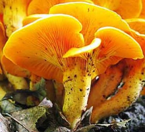
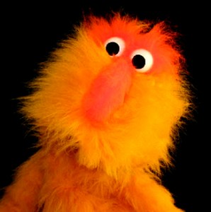
It remained one of my favorite colors for many years before a very good friend (Rebecca Jean Nelson, currently of Seattle, Washington) & I decided to give it the honor it was due – naming it “muntella” back in the late 90’s. I’ve been spreading this name around ever since, waiting patiently for the day when I hear someone mention that “muntella” is their favorite color, or even “Hey look at that muntella sunset.” We’ll see … help me spread the word, won’t you?
As far as my least favorite color is concerned, it has always been bright pink.
Whether or not this queasiness came in response to some early adolescent trauma related to a pink-clad damsel remains unclear.
All I know is that the color, if I’m not attentively conscious, can give me the “heebie-jeebies”.
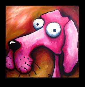
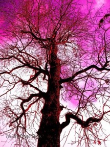
Well, today I’m taking this color back! I’m renaming it “brosa”, and am purposefully seeing it as the color of gentle strength.
Archetypally, by the way, muntella is the color of Purpose (a.k.a. Vocation or our Life-Mission), and brosa is the color of active, unconditional Love. Seeing as how every person’s Vocation IS essentially finding a way to actively Love others unconditionally, these two colors compliment one another perfectly.
Imagine that!
See You when I see you …
… and until then, Be Now!
Scaughdt







 ;
;